 Acad
AcadBest Python Libraries for GIS and Mapping: A Fair 2026 Comparison
Choosing the best Python libraries for GIS and mapping in 2026 comes down to one question: static figure or interactive web map? This guide compares the main Python mapping libraries honestly (GeoPandas, Folium, Cartopy, Contextily, Plotly, Kepler.gl, and AcadGIS) so you can pick the right tool the first time. We lead with a comparison table, then explain exactly when each library wins and which free datasets feed them.
The 2026 Python mapping libraries at a glance
Before the details, here is the fair comparison. Every library in this table is genuinely good at something; the trick is matching the tool to your output. If you are writing a paper you need static, high-resolution figures; if you are building a dashboard you need interactive HTML. That single axis explains most of the differences below.
This is the Python GIS library shortlist for 2026 that covers roughly 95% of research and analysis mapping tasks. Everything else (rasterio, shapely, pyproj, geoplot) tends to sit underneath these as a dependency rather than being what you actually draw with.
| Library | Static / Interactive | Basemaps | Projections | Learning curve | Best for |
|---|---|---|---|---|---|
| GeoPandas | Static (Matplotlib) | Via Contextily | Reprojects, no graticules | Moderate | Spatial data wrangling, joins, static choropleths |
| Folium | Interactive (Leaflet) | Built-in tiles | Web Mercator only | Easy | Zoomable web maps and quick data exploration |
| Cartopy | Static (Matplotlib) | Add-on tiles | Best-in-class, graticules | Steep | Projection-accurate scientific and global maps |
| Contextily | Static helper | Yes (OSM, Esri satellite) | Expects Web Mercator input | Easy | Adding tile basemaps to GeoPandas plots |
| Plotly | Interactive (JS) | Mapbox / tiles | Web Mercator + a few | Moderate | Interactive dashboards and hover analytics |
| Kepler.gl | Interactive (WebGL) | Built-in | Web Mercator | Easy (GUI) | Large point/trip datasets, visual exploration |
| AcadGIS | Static (publication) | Built-in (OSM, satellite, terrain) | Handled automatically | Easy | Publication-ready study-area and research maps |
GeoPandas vs Folium vs Cartopy: the core decision
The GeoPandas vs Folium vs Cartopy question is the one most people actually mean when they ask about Python mapping libraries, so let us settle it plainly.
GeoPandas is the workhorse. It extends pandas with geometry columns, reads Shapefiles, GeoJSON and GeoPackage, does spatial joins and dissolves, and plots to Matplotlib. If your task is "load boundaries, join a data table, colour by a value," GeoPandas is the honest default. Folium wraps Leaflet.js to emit an interactive HTML map with slippy tiles: perfect for exploration or a web page, but it renders in the browser and is locked to Web Mercator, so it is a poor fit for print figures. Cartopy is the specialist: it handles dozens of projections correctly and draws proper graticules, which matters enormously for continental or polar maps where Web Mercator badly distorts area.
In practice these are complementary, not rivals. A common academic stack is GeoPandas for the data plus Cartopy for the projection, with Contextily dropping in a basemap. The friction is that wiring all three together (CRS matching, extent handling, adding a north arrow and scale bar by hand) is where an afternoon quietly disappears.
Basemaps and satellite imagery: Contextily and friends
None of GeoPandas, Cartopy, or Matplotlib ship basemaps. Contextily fills that gap by fetching XYZ tiles (OpenStreetMap, CartoDB, Esri satellite) and pasting them behind your data. It is a few lines and works well, with one catch that trips everyone up: your data must be reprojected to Web Mercator (EPSG:3857) first, or the tiles will not line up.
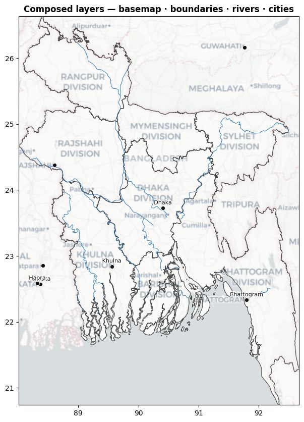
For interactive maps, Folium, Plotly, and Kepler.gl all include basemaps natively. Kepler.gl in particular is excellent for very large point or trip datasets thanks to WebGL rendering, though it is more of a GUI-first tool than a scripting library. If your goal is a static figure with a clean satellite or terrain backdrop and correct furniture, a library that manages the reprojection and basemap for you saves real time. AcadGIS takes that route with a single high-level Python GIS mapping API that adds the basemap, boundaries, and rivers as composable layers.
import acadgis as agis
gdf = agis.load_boundaries("Bangladesh", level="district")
ax = agis.plot(gdf, theme="academic", title="Study region")
agis.add_basemap(ax, style="satellite")
agis.add_rivers(ax, by_order=True)
agis.add_cities(ax, area=gdf)
agis.save("region.png", dpi=300)Choropleths: static for papers, interactive for the web
Choropleth maps are the most common request, and the output medium decides the tool. For a static, high-resolution choropleth in a manuscript, GeoPandas with a good classification scheme (quantiles or natural breaks) rendered to Matplotlib is the standard. For an interactive choropleth on a web page, Folium or Plotly win because readers can hover and zoom.
The fiddly parts are always the same: joining your data table to the geometry on a shared key, choosing a classification scheme, and building a readable legend. AcadGIS collapses that into one call via its choropleth map generator, which handles the join, the scheme, and the legend so the figure is publication-ready by default. You still keep full control over palette and breaks whenever you want it.
import acadgis as agis
states = agis.load_boundaries("USA", level="state")
ax = agis.choropleth(states, data=income_df, on="state",
                     value="median_income", scheme="quantiles",
                     palette="viridis", title="Median income by state")
agis.save("income_choropleth.png", dpi=300)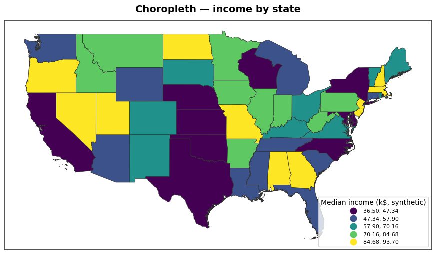
Free data behind every Python mapping library
One honest point that comparison posts often skip: the drawing library is not the hard part, the data is. Whether you choose GeoPandas, Cartopy, or AcadGIS, you draw the same open datasets underneath. Knowing which source answers which question saves far more time than switching libraries. The reference table below lists the free sources that power most academic and analytical maps, all usable from Python.
These sources are why a study-area map generator can produce a correct locator figure offline: administrative boundaries come from GADM and Natural Earth, terrain from Copernicus GLO-30, and land cover from ESA WorldCover, none of which require a paid API key.
| Source | Type | Resolution / level | Typical use |
|---|---|---|---|
| Natural Earth | Vector boundaries | 1:10m to 1:110m | Country and coastline base layers |
| GADM | Vector boundaries | National to district | Administrative study-area maps |
| OpenStreetMap | Vector features | Street-level | Roads, rivers, POIs, basemap tiles |
| ESA WorldCover | Raster land cover | 10 m | Land-use and habitat mapping |
| Copernicus GLO-30 | Raster DEM | 30 m | Terrain, hillshade, relief |
| Sentinel-2 | Raster imagery | 10 m multispectral | NDVI, vegetation, change detection |
Where AcadGIS fits: publication-ready study-area maps
AcadGIS is not trying to replace GeoPandas or Cartopy; it sits on top of that ecosystem for one specific job: publication-ready research maps, especially the study-area locator figure that nearly every thesis and paper needs. That figure (a country inset with the study region highlighted, connected to a zoomed district panel, with scale bars and north arrows) is tedious to assemble by hand in Matplotlib.
With AcadGIS it is one function. The study-area generator produces the cascade layout, projections, and figure furniture automatically, and exports at 300 DPI. Bangladesh, Iraq, India, and the USA are bundled offline (drawing on Natural Earth and GADM-style boundaries); other countries download by name. It is honest to say: if you need interactivity, reach for Folium or Kepler.gl instead; if you need an exotic projection, Cartopy gives you finer control. AcadGIS optimises for the common academic case where you want a clean, correct static figure fast.
import acadgis as agis
fig = agis.study_area("Bangladesh",
        steps=[("division", "Dhaka"), ("district", "Madaripur")],
        template="cascade", rivers=True, labels=True)
agis.save("study_area.png", dpi=300)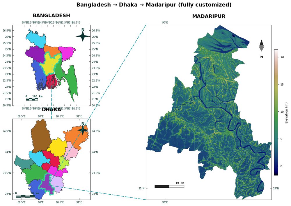
How to choose in under a minute
Here is the decision shortcut. Need an interactive web map? Use Folium for simple slippy maps, Plotly for hover-driven dashboards, or Kepler.gl for millions of points. Need a static figure? Use GeoPandas for data-driven choropleths, Cartopy when projection accuracy is non-negotiable, and add Contextily if you want a tile basemap behind it.
Need a publication-ready study-area or research map without wiring five libraries together? Use AcadGIS. And remember the desktop options: QGIS and ArcGIS Pro remain excellent for interactive, click-driven cartography and heavy editing, but they are harder to script and reproduce than a few lines of Python. For reproducible figures that regenerate from code when your data changes, the Python route wins, and that reproducibility is the real reason the best Python libraries for GIS and mapping keep gaining ground in research workflows.
Frequently asked questions
What is the best Python library for GIS and mapping in 2026?
There is no single best Python library for GIS and mapping in 2026; the right choice depends on your output. GeoPandas is best for spatial data and static choropleths, Folium and Kepler.gl for interactive web maps, Cartopy for projection-accurate figures, and Contextily for basemaps. For publication-ready research and study-area maps, AcadGIS bundles these capabilities behind a single high-level API.
What is the difference between GeoPandas, Folium, and Cartopy?
GeoPandas is a pandas-based library for reading, joining, and analyzing vector spatial data and rendering static Matplotlib maps. Folium wraps Leaflet.js to produce interactive HTML maps with tile basemaps but is locked to Web Mercator. Cartopy specializes in cartographic projections and graticules for scientifically accurate static maps. They are complementary, and many workflows combine GeoPandas for data with Cartopy for projection-correct figures.
Can Python make publication-ready maps for research papers?
Yes, Python can make publication-ready maps for research papers using Matplotlib-based tools such as GeoPandas, Cartopy, and AcadGIS, which export high-resolution static figures with north arrows, scale bars, and legends. AcadGIS is built specifically for this and generates study-area locator figures and choropleths at 300 DPI from a few lines of code.
Is GeoPandas or Folium better for choropleth maps?
For static choropleth maps in papers and reports, GeoPandas is better because it renders to Matplotlib at high resolution with full control over classification schemes. Folium is better when you need an interactive, zoomable choropleth embedded in a web page. AcadGIS offers a one-line choropleth function that handles the data join and classification for static publication figures.
Do these Python mapping libraries need an internet connection?
It depends on the data. GeoPandas and Cartopy work fully offline once you have local boundary files, while Folium, Contextily, Plotly, and Kepler.gl fetch map tiles online by default. AcadGIS bundles Bangladesh, Iraq, India, and the USA for offline use and downloads other countries by name, drawing on open data like Natural Earth, GADM, OpenStreetMap, ESA WorldCover, and Copernicus GLO-30.
Should I use Python or QGIS for GIS mapping?
Use Python when you want reproducible maps that regenerate automatically as your data changes, and QGIS or ArcGIS Pro when you want interactive, click-driven cartography and manual editing. Python libraries like GeoPandas, Cartopy, and AcadGIS let you version-control and re-run your figures, which is why they are increasingly preferred for research workflows.