 Acad
AcadHow to Make a GIS Map for a Research Paper in Python
A GIS map for a research paper is a figure that shows where your study happened and what you found, rendered cleanly enough to survive a journal's resolution and labelling checks. AcadGIS builds these study-area, choropleth and sampling-site maps in a few lines of Python and exports them at print quality.
What is a GIS map for a research paper, and why researchers need one
A GIS map for a research paper is the figure reviewers use to understand your spatial context: a locator that places your study area on the world, a choropleth that shows a variable across regions, or a site map that marks where you collected data. Unlike an exploratory screenshot from desktop GIS, a paper figure has to satisfy explicit production rules — usually 300 DPI or higher for raster art, legible fonts at print size, a scale bar and north arrow, a clear legend, and a cited data source.
Researchers need one because journals and thesis committees reject figures that are pixelated, unlabelled, or unreproducible. Rebuilding a map by hand in a GUI every time a reviewer asks for a change is slow and error-prone. Writing the map as a short Python script makes the figure deterministic, version-controllable, and regenerated in seconds. If your deliverable is a dissertation rather than a journal article, the same workflow powers our thesis map maker.
Make one in Python: a study-area locator
The most common figure is a study-area locator that nests your site inside its country and administrative context. AcadGIS builds the cascade — country to division to district — and applies the academic theme, a north arrow and a scale bar by default, so the output is already close to submission-ready. Change the file extension in save() to switch between PNG, PDF and SVG.
For a dedicated locator workflow with more layout templates, see the study-area map generator.
import acadgis as agis
fig = agis.study_area("Bangladesh",
    steps=[("division", "Dhaka"), ("district", "Madaripur")],
    template="cascade", labels=True)
agis.save("study_area.pdf", dpi=300)  # or .png / .svg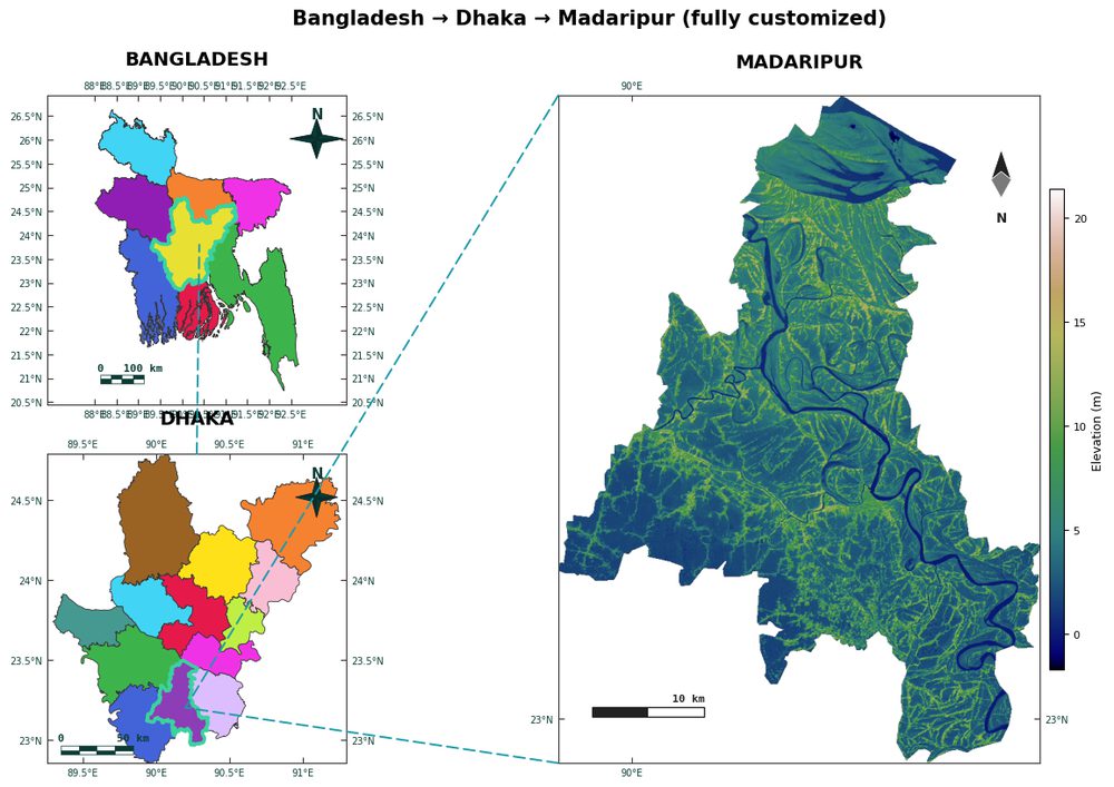
Choropleth maps for showing results across regions
When your result is a value per region — income, prevalence, yield, temperature — a choropleth communicates it directly. AcadGIS matches your data table to boundary names with fuzzy matching, so you rarely need to clean region strings by hand. Pick a colour-blind-safe palette like viridis and a classification scheme such as quantiles or equal intervals to match your statistical intent.
The legend, title and classification are all controllable, which matters when a reviewer asks for a specific number of classes. A focused walkthrough lives on the choropleth map generator page.
import acadgis as agis
states = agis.load_boundaries("USA", level="state")
m = agis.choropleth(states, income_df, key="state",
    value="median_income", palette="viridis",
    scheme="quantiles", title="Median household income")
agis.save("income_choropleth.png", dpi=300)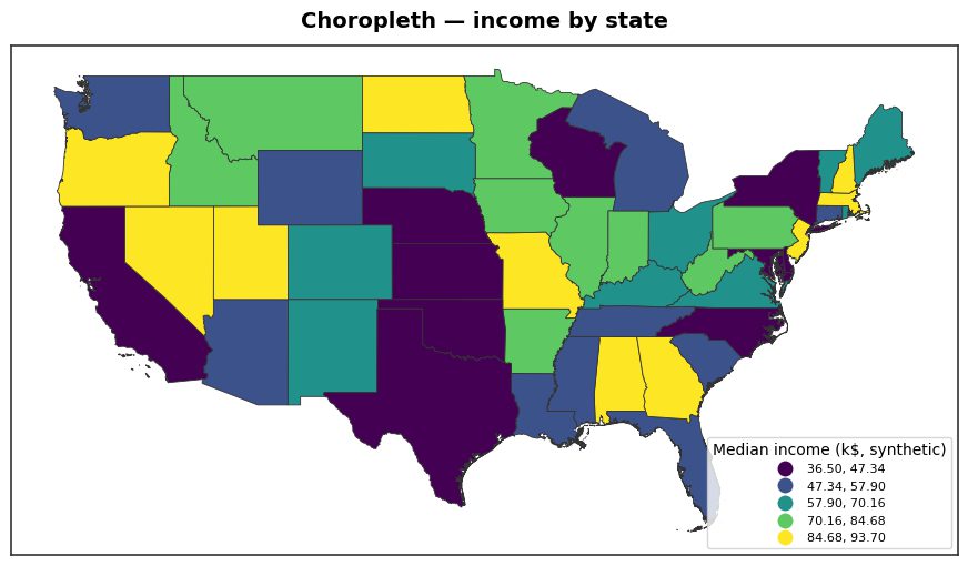
Field-site and sampling maps on a satellite basemap
Methods sections often need a site map: the exact points where you sampled, plotted on real imagery so readers can judge terrain and land cover. AcadGIS draws points over a satellite or OSM basemap and can size or colour them by an attribute, which turns a plain location map into a small data figure.
Because the imagery comes from named sources, the map stays citable. For a full sampling workflow — buffers, transects and multi-site layouts — use the sampling site map generator.
import acadgis as agis
area = agis.load_boundaries("Bangladesh", level="district", within="Dhaka")
ax = agis.plot(area, theme="academic", title="Field sites, Gazipur")
agis.add_basemap(ax, style="satellite")
agis.points(ax, sites_df, lon="lon", lat="lat", value="n", size_by="n")
agis.save("field_sites.png", dpi=300)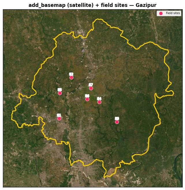
Meeting journal resolution, labelling and export requirements
Most journals want raster figures at 300 DPI (600 DPI for fine line art) and vector formats for anything with text or sharp edges. AcadGIS exports by extension: agis.save("fig.pdf", dpi=300) for PDF, .svg for scalable vector art, and .png when a raster is required. Vector output keeps labels crisp at any zoom, which is why editors prefer it for figures containing type.
For labelling, the academic theme sizes fonts for print, and the north arrow, scale bar, graticule and legend are each toggled with keyword arguments on plot() so you can match a target template exactly. Keep titles short, let the caption carry detail, and confirm the smallest label is still legible when the figure is scaled to one column width.
Data sources you can cite
Every layer in AcadGIS traces back to a named, citable source, which reviewers increasingly expect:
- Administrative boundaries — GADM, via
load_boundaries(). - Country outlines, coastlines and rivers — Natural Earth (
add_rivers,add_sea). - Roads and detailed features — OpenStreetMap (
add_roads). - Satellite imagery and NDVI — Sentinel-2 (
add_basemap,add_ndvi). - Land cover — ESA WorldCover 10 m (
add_landcover). - Elevation and terrain — Copernicus GLO-30 DEM (
load_dem,relief).
Cite the source of each layer in your figure caption or methods section. Because the figure is generated from code, you can list the exact functions and datasets used, making the map fully reproducible for readers and referees.
How to make a GIS map for a research paper with AcadGIS
- Install and import. Run pip install acadgis, then start every script with import acadgis as agis.
- Load your study area. Call load_boundaries() with a country and level, or use study_area() to cascade from country down to district.
- Add your data or layers. Use choropleth() for a value per region, or plot() plus points() and add_basemap() for a site map.
- Apply publication defaults. Keep theme="academic" and leave north_arrow, scale_bar and legend on so the figure meets labelling expectations.
- Export at print resolution. Call agis.save("figure.pdf", dpi=300), swapping the extension for PNG or SVG as the journal requires.
- Cite your sources. Note GADM, Natural Earth, OpenStreetMap, Sentinel-2, ESA WorldCover or Copernicus GLO-30 in the caption.
Frequently asked questions
What resolution should a GIS map for a research paper be?
Most journals require at least 300 DPI for raster figures, and 600 DPI for fine line art. AcadGIS exports at any DPI with agis.save('figure.png', dpi=300), and can produce vector PDF or SVG that stays sharp at any size.
Can AcadGIS export maps as PDF and SVG for journal submission?
Yes — AcadGIS chooses the format from the file extension, so agis.save('fig.pdf') and agis.save('fig.svg') produce vector output. Editors generally prefer vector formats for figures containing text or sharp lines.
Do I need GIS experience to make a research map with AcadGIS?
No — the whole workflow is a short Python script starting with import acadgis as agis, and the academic theme supplies publication-ready defaults. You do not need desktop GIS software like QGIS or ArcGIS.
Where does AcadGIS get its map data?
Boundaries come from GADM, with coastlines and rivers from Natural Earth, roads from OpenStreetMap, imagery from Sentinel-2, land cover from ESA WorldCover, and elevation from the Copernicus GLO-30 DEM. Every layer is citable in your methods or caption.
How do I make a study-area locator map for my paper?
Call agis.study_area('Bangladesh', steps=[('division','Dhaka'),('district','Madaripur')], template='cascade'), which nests your site inside its administrative context. It ships with a north arrow, scale bar and academic styling by default.
Can I make a choropleth of my results by region?
Yes — load boundaries with load_boundaries() and pass your data table to choropleth() with a value column, palette and classification scheme. Fuzzy name matching aligns your data to region names automatically.
Is AcadGIS free to use for academic work?
Yes — the AcadGIS Python package is free and open-source under the Apache-2.0 licence. You can install it with pip install acadgis and use it for papers, theses, grants and reports at no cost.