 Acad
AcadResearch Area Map Generator for Publication-Ready Figures
A research area map generator turns raw boundaries and site coordinates into a clean, reviewer-friendly figure that shows exactly where your study happened. AcadGIS does this in a few lines of Python, pairing a highlighted research region with plotted sampling sites and an automatic locator inset.
What is a research area map generator, and why researchers need one
A research area map generator assembles a study-location figure from three ingredients: an administrative or natural boundary for your research region, a set of point locations for your sampling or field sites, and a small locator inset that orients the reader within the wider country or continent. Together these answer the first question every reviewer asks about spatial work: where, exactly, did this happen?
Hand-building such a figure in a desktop GIS is slow and rarely reproducible. Reviewers routinely flag study maps that lack a scale bar, north arrow, or any indication of geographic context. A generator that encodes these cartographic conventions by default removes that friction and keeps the whole figure scriptable, so a revised dataset means re-running a cell rather than redrawing by hand. AcadGIS is built around exactly this workflow, and it pairs naturally with a dedicated study area map generator and sampling site map generator for more specialized layouts.
Make a research area map in Python
The fastest path is the StudyArea builder. You name a country for context, zoom into your region, and call figure() — AcadGIS draws the zoomed research area as the main panel and adds a locator inset automatically. The example below produces a Gazipur research-area map set inside Bangladesh, with a north arrow, scale bar and legend added for you.
Prefer a multi-panel layout that walks the reader from country to district? The study_area() function offers single, two, cascade, series and grid templates driven by a list of drill-down steps, so one call can render the full geographic hierarchy shown below.
import acadgis as agis
sa = agis.StudyArea("Bangladesh", context_level="state")
sa.zoom_into("Gazipur", detail_level="district")
fig = sa.figure(suptitle="Research area: Gazipur, Bangladesh")
agis.save("research_area.png", dpi=300)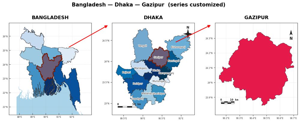
Plot sampling sites on the research area
Once the region is framed, overlay your field sites. Load the boundary with load_boundaries(), draw it with plot(), then drop your coordinates on with agis.points(). Because points() takes an axis, you can layer sites over a satellite basemap so reviewers see the real terrain, roads and rivers around each station.
Passing size_by turns your markers into graduated symbols scaled by a measured value — useful for showing catch counts, contaminant concentrations, or sample sizes at a glance. See the sampling site map generator for more on symbolizing site data.
import acadgis as agis
gdf = agis.load_boundaries("Bangladesh", level="district", within="Dhaka")
ax = agis.plot(gdf, highlight="Gazipur", title="Field sites, Gazipur")
agis.add_basemap(ax, style="satellite")
agis.points(ax, sites, lon="lon", lat="lat", size_by="n", legend=True)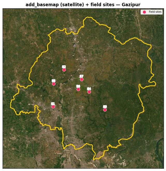
Example use cases across disciplines
The same generator serves very different papers. An ecologist highlights a watershed and plots trap locations sized by species abundance; a hydrologist marks gauging stations along a river network; an epidemiologist shows clinics across a district; a soil scientist maps a transect of sampling pits inside a single upazila. In each case the recipe is identical — frame the region, add an inset, drop the points — which is what makes the workflow reusable across a lab.
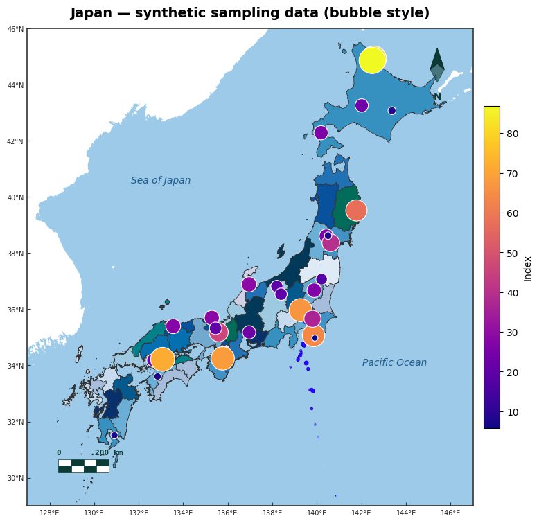
When sampling intensity itself is the message, graduated bubble symbols read more clearly than uniform dots. The map below shows survey counts as scaled bubbles over Japan — the same size_by mechanic, applied at national scale. For manuscript figures that combine this with tables and captions, the GIS map for research paper guide covers layout and export settings.
Data sources and tips
AcadGIS pulls administrative boundaries from GADM, with Bangladesh, Iraq, India and the USA bundled so they work fully offline; other countries download by name on first use. Basemaps come from Esri satellite imagery, OpenStreetMap and Natural Earth, and elevation from Copernicus GLO-30. Live environmental layers such as land cover (ESA WorldCover 10 m) and vegetation greenness (Sentinel-2 NDVI) can be added when ecological context matters.
A few practical tips: keep your site coordinates in plain decimal degrees (WGS84) with lon/lat columns; let the inset use a coarser context_level than your main panel so the locator stays legible; and always export at dpi=300 for print. If you only need the context panel without sites, the standalone study area map generator covers that case directly.
How to generate a research area map with a locator inset in AcadGIS
- Install and import. Run pip install acadgis, then start your script with import acadgis as agis.
- Frame the research region. Create agis.StudyArea("Bangladesh", context_level="state") and call zoom_into("Gazipur", detail_level="district") to focus on your region.
- Draw the figure with an inset. Call sa.figure(suptitle="Research area: Gazipur") to render the zoomed panel with an automatic locator inset, north arrow and scale bar.
- Add sampling sites. Overlay your coordinates with agis.points(ax, sites, lon="lon", lat="lat", size_by="n", legend=True) to plot field stations as graduated symbols.
- Export for publication. Save the figure at print resolution with agis.save("research_area.png", dpi=300).
Frequently asked questions
What is a research area map generator?
It is a tool that builds a study-location figure showing your highlighted research region, plotted sampling sites, and a locator inset for geographic context. AcadGIS generates one in a few lines of Python with a north arrow, scale bar and legend included by default.
How do I add a locator inset to my research area map?
Use agis.StudyArea(country).zoom_into(region).figure(), which draws the zoomed region as the main panel and adds a context inset automatically. The inset shows where your region sits within the wider country.
Can I plot sampling sites on the map?
Yes. Load your site coordinates into a DataFrame and call agis.points(ax, sites, lon="lon", lat="lat") to overlay them. Passing size_by scales each marker by a measured value to create graduated symbols.
Where does AcadGIS get its boundary data?
Administrative boundaries come from GADM, with Bangladesh, Iraq, India and the USA bundled for offline use. Other countries download by name, and basemaps use Esri satellite imagery, OpenStreetMap and Natural Earth.
Does the map work offline?
Yes for the four bundled countries — Bangladesh, Iraq, India and the USA — whose GADM boundaries ship with the package. Other countries and live satellite or land-cover layers require an internet connection on first use.
What resolution should I export at for a paper?
Export at 300 DPI using agis.save("map.png", dpi=300), which is the standard for print-quality journal and thesis figures. AcadGIS renders crisp vector-backed output so text and lines stay sharp at that resolution.
How is this different from a study area map generator?
A study area map generator focuses on framing the region and its context panels, while a research area map generator adds plotted sampling sites on top of that frame. In AcadGIS the same StudyArea and points functions cover both cases.