 Acad
AcadChoropleth Map Generator: Shade Regions by Value in Python
This Choropleth map generator joins a spreadsheet to administrative boundaries by region name — using fuzzy matching so "St. Louis" and "Saint Louis" still line up — and shades each region by value in a few lines of Python. You control the classification scheme and pick colourblind-safe palettes so the figure reads correctly in print and on screen.
What is a choropleth map generator, and why researchers need one
A choropleth map generator takes a table of values — one row per region — and colours a map so that each region is shaded according to its number. Population density by district, unemployment by state, disease incidence by division: any quantity attached to an administrative unit becomes a map where colour encodes magnitude. For a paper, thesis or grant report, a choropleth communicates a spatial pattern in one glance that a table of numbers never will.
The tedious part has always been the join. Your spreadsheet says Barisal; the shapefile says Barishal. Your data lists Washington the state and the software matches Washington the county. AcadGIS solves this with name-based fuzzy matching: you supply a value column and a region-name key, and it aligns your rows to the boundary polygons for you. If you need the underlying polygons first, the administrative boundary map generator fetches them by name at any level.
Make a choropleth map in Python
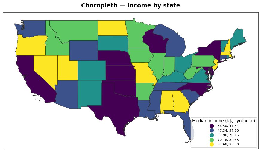
Load boundaries for a country and level, then hand your data to choropleth(). It matches your region names to the polygons, classifies the values and shades them. The example below colours US states by an income column; the same three lines work for Bangladesh districts or Indian states.
Point key at the column in your data holding region names, and value at the number to shade by. The on argument names the boundary attribute to match against when it is not detected automatically.
import acadgis as agis
states = agis.load_boundaries("USA", level="state")
df = agis.pd.read_csv("income_by_state.csv")
agis.choropleth(states, df, key="state", value="median_income",
                palette="viridis", scheme="quantiles",
                title="Median household income by state")
agis.save("income.png", dpi=300)
Classification schemes: how the data gets binned
The scheme argument decides how continuous values are grouped into colour classes, and it changes the story the map tells. Choose it deliberately:
- quantiles — equal counts of regions per class. Good for skewed data and for showing rank; a sensible default when you want a balanced legend.
- equal_interval — equal value ranges per class. Best when the raw magnitude matters and readers will compare one map against another.
- natural breaks — cuts placed where the data clusters, minimising within-class variance so real groupings stay intact.
Fewer classes (four to six) read more clearly in print than a fine gradient. If your variable is a rate or ratio rather than a count, map the normalised value so that large regions do not dominate purely by area — shading raw counts is the single most common choropleth mistake, because a populous or physically large unit looks intense regardless of its underlying rate.
Colourblind-safe palettes
Roughly one in twelve men has a colour vision deficiency, so a red–green scheme can be unreadable to a meaningful share of your audience. AcadGIS defaults to viridis, a perceptually uniform sequential palette that stays legible in colourblind simulation and in greyscale — which matters when a journal prints your figure in black and white.
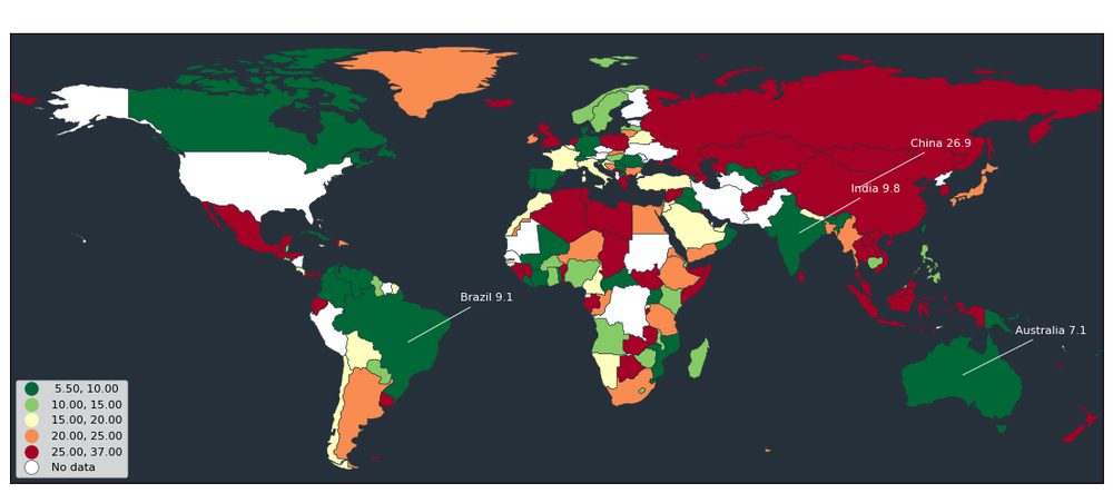
For sequential data (low to high) keep a single-hue or viridis-family palette so the order is unambiguous. Reserve diverging palettes for data with a meaningful midpoint, such as change relative to a baseline. Pass any of these through the palette argument. When you need the same defensible defaults across every figure in a manuscript, the GIS map for research paper workflow keeps theme, palette and export settings consistent.
Examples and use cases
Choropleths fit almost any regional variable in the social, health and environmental sciences:
- Demography — population density, median age or literacy by district or division.
- Public health — incidence, vaccination coverage or access-to-care rates by administrative unit.
- Economics — GDP per capita, poverty headcount or employment by state.
- Environment — mean rainfall, forest cover or emissions aggregated to region boundaries.
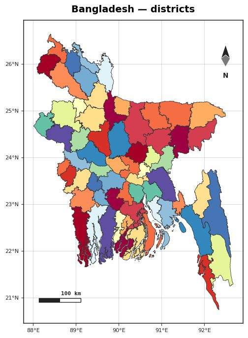
To shade sub-national units, load the finer level and join on that name column — for Bangladesh you might use districts or upazilas. Where regions cluster tightly and equal-area shading hides small units, an aggregated point view like the hexbin spatial analysis map can complement the choropleth by revealing density that polygon shading flattens.
Data sources and tips
Boundary polygons come from GADM, the database of global administrative areas, fetched by load_boundaries and cached locally so repeat runs work offline. Bangladesh, Iraq, India and the USA ship bundled; other countries download by name on first use. Natural Earth and OpenStreetMap supply optional context layers such as coastlines and rivers.
A few tips for clean results: keep region names in your CSV as close to the official spelling as you can, even though fuzzy matching is forgiving; check the join by eye before trusting it, since an unmatched region simply draws blank; normalise counts to rates when comparing regions of very different size; and export at 300 dpi with agis.save() for print. Where your data carries a stable code column, match on that instead of a name for the most reliable join.
How to make a choropleth map from a spreadsheet with AcadGIS
- Load the boundaries. Call agis.load_boundaries(country, level=...) to fetch admin polygons — for example USA states or Bangladesh districts — from GADM.
- Read your data. Load your CSV or DataFrame with agis.pd, keeping one row per region and a column with region names plus the value to map.
- Join and shade. Pass the boundaries and data to agis.choropleth() with key set to your name column and value to the number; fuzzy matching aligns names automatically.
- Choose scheme and palette. Set scheme to quantiles, equal_interval or natural breaks, and palette to a colourblind-safe option like viridis.
- Export at print quality. Call agis.save('map.png', dpi=300) to write a publication-ready figure for your paper or thesis.
Frequently asked questions
What is a choropleth map generator?
A choropleth map generator shades administrative regions by a data value, so colour encodes magnitude across a map. AcadGIS provides one through the agis.choropleth() function, which joins your spreadsheet to boundary polygons and colours them.
How does AcadGIS match my spreadsheet to the map?
It joins your data to boundary polygons by region name using fuzzy matching, so small spelling differences like 'Barisal' versus 'Barishal' still line up. You point the key argument at your name column and it handles the alignment.
Which classification schemes can I use?
AcadGIS supports quantiles, equal_interval and natural breaks through the scheme argument. Quantiles put equal counts of regions in each class, while equal_interval uses equal value ranges.
Are the default colours colourblind-safe?
Yes — the default viridis palette is perceptually uniform and remains legible under colour vision deficiency and in greyscale. You can swap palettes with the palette argument while keeping that property.
Where do the boundaries come from?
Administrative boundaries come from GADM, the database of global administrative areas, fetched by load_boundaries and cached for offline reuse. Natural Earth and OpenStreetMap provide optional context layers such as coastlines and rivers.
Can I make a choropleth of districts or provinces, not just countries?
Yes — set the level argument on load_boundaries to state, district, division or upazila, then join your data on that region name. Any level GADM provides can be shaded by value.
Do I need to know GIS or shapefiles to use it?
No — you name a country and level and AcadGIS fetches the polygons for you, so there are no shapefiles to download or manage. You only supply a spreadsheet with region names and values.