 Acad
AcadHow to Make a Choropleth Map in Python (Without the Name-Matching Headaches)
Learning how to make a choropleth map in Python is easy right up until you try to join your spreadsheet to real boundaries, and the names refuse to match. Most tutorials show you a clean demo dataset where every region lines up perfectly, then leave you stranded the moment your CSV says "Comilla" and the shapefile says "Cumilla." This guide covers the whole workflow honestly: loading boundaries, joining a value table by name, surviving the name-matching mess, and picking a classification scheme that tells the truth about your data.
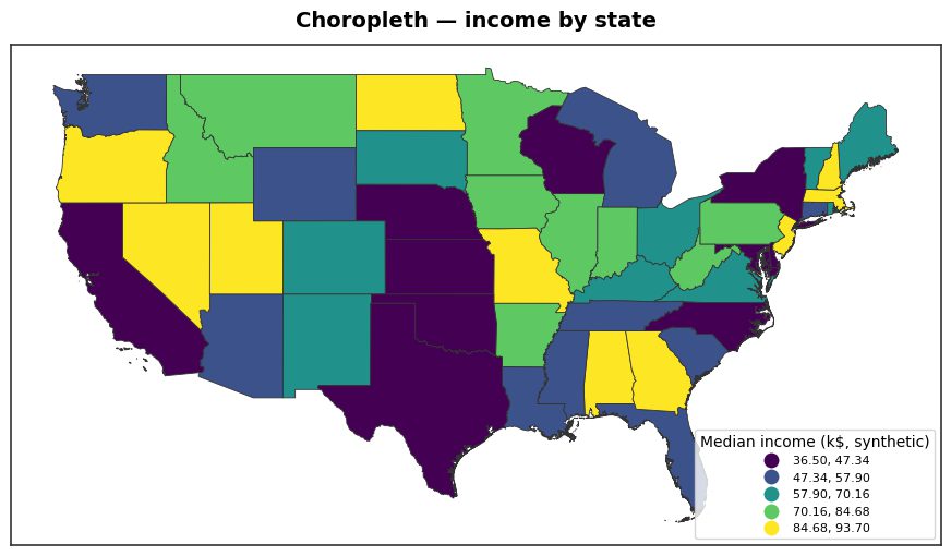
What a choropleth map actually is (and when to use one)
A choropleth map shades predefined areas — countries, states, districts — by a value, using color intensity to encode that value. It answers questions like “which districts have the highest literacy rate?” or “how does median income vary across US states?”
Use a choropleth when your data is tied to administrative units and expressed as a rate or normalized quantity (per-capita income, percent unemployed, density). Do not map raw counts on a choropleth: big areas look important just because they are big. For raw event locations, reach for a hexbin spatial analysis map or a dot-density map instead. The choropleth's whole job is to compare like-for-like areas, so the value must already be comparable across them.
The two ingredients: boundaries + a value table
Every choropleth map in Python needs exactly two inputs: (1) polygon geometry for your areas, and (2) a table of values keyed by area name. The classic geopandas stack gets the geometry from a shapefile or GeoJSON — GADM (via the pygadm package) for national and sub-national units, Natural Earth for world and coarse admin-1 layers, or OpenStreetMap for fine detail. Your value table is usually a CSV you already have.
In plain geopandas you would gpd.read_file() the boundaries, pd.read_csv() the data, and merge() them. AcadGIS collapses the boundary step to one call and ships Bangladesh, Iraq, India and the USA offline:
import acadgis as agis

# admin-1 (states/divisions) or admin-2 (districts)
gdf = agis.load_boundaries("USA", level="state")
data = agis.pd.read_csv("income_by_state.csv")  # columns: state, income
print(gdf.head(), data.head())
The part every tutorial skips: name matching
Here is where a python choropleth from csv falls apart. Your CSV and your boundaries were made by different people, so the join keys disagree. A plain merge() on the name column drops every row that doesn't match exactly, and those areas render as blank holes in your map. Common failure cases:
- Spelling / romanization: Comilla vs Cumilla, Jessore vs Jashore, Kolkata vs Calcutta.
- Spacing / punctuation: “West Bengal” vs GADM's “WestBengal”; “St. Louis” vs “Saint Louis”.
- Case and trailing whitespace that you can't see but
==can.
The honest fix in raw geopandas is to normalize both sides (lowercase, strip, deburr) and hand-build a crosswalk for the stragglers — tedious but doable. AcadGIS bakes fuzzy matching into choropleth() and warns you about any names it still couldn't place instead of silently dropping them, so you get a list of fixes rather than a mysteriously patchy map:
import acadgis as agis

gdf = agis.load_boundaries("Bangladesh", level="district")
data = agis.pd.read_csv("literacy.csv")   # "Comilla" -> matches "Cumilla"

# fuzzy join by name; unmatched names raise a warning, not a silent blank
agis.choropleth(gdf, data, value="literacy", scheme="quantiles",
                title="District literacy rate")
agis.show()
Choosing a classification scheme (with a cheat-sheet)
Once the join works, the single most consequential decision is how you bin values into color classes. The same data can look alarming or unremarkable depending on the scheme. Under the hood this is the mapclassify library, which geopandas and AcadGIS both use; the difference is only how you invoke it. Pass the name you want to choropleth(..., scheme=...). Here is when to reach for each:
| Scheme | AcadGIS / mapclassify name | How it splits data | Best for |
|---|---|---|---|
| Quantiles | quantiles | Equal count of areas per class | Skewed real-world data; guarantees every color is used and no class is empty |
| Equal interval | equal_interval | Equal value-width bins | Evenly-spread data with a meaningful range (percentages, scores) |
| Natural breaks (Jenks) | natural_breaks / fisher_jenks | Minimizes within-class variance | Clustered data where you want breaks to follow natural gaps |
| Standard deviation | std_mean | Bins measured in std devs from the mean | Showing how far each area sits above/below average (diverging story) |
Putting it together: CSV to publication-ready map
This is the full geopandas choropleth workflow, condensed. Because choropleth() defaults to the academic theme, you get a north arrow, scale bar, graticule and a classed legend without extra code — the things you'd otherwise wire up by hand with matplotlib. Point key at your CSV's join column, then swap palette and scheme to retell the story:
import acadgis as agis

gdf = agis.load_boundaries("USA", level="state")
data = agis.pd.read_csv("income_by_state.csv")

agis.choropleth(gdf, data, value="income", key="state",
                scheme="natural_breaks", palette="viridis",
                title="Median household income by state")
agis.save("income_choropleth.png", dpi=300)
When to script it and when not to
Reproducible, versioned, part of a paper's figure pipeline? Script it in Python — the choropleth() call above is deterministic and diff-able. Need a world map with labels, or a national/district base you don't want to hunt down? AcadGIS's administrative boundary map generator covers the geometry side, and load_boundaries() downloads any country by name.
If you're not a coder, or you just want to drag in a spreadsheet and get a shaded map back, the point-and-click choropleth map generator runs the same fuzzy join and classification in the browser. Same result, no environment to set up. For honest comparison: QGIS and folium can both make choropleths too — QGIS is superb for interactive exploration and folium for web maps — but neither solves the name-matching problem for you, and that is usually where the hour actually goes.
Frequently asked questions
How do I make a choropleth map in Python from a CSV file?
Load your admin boundaries as a GeoDataFrame, read your CSV with pandas, then join the two on the region-name column and shade polygons by the value. The join is the hard part because spellings rarely match exactly; AcadGIS's choropleth() does a fuzzy name match automatically, so agis.choropleth(gdf, df, value="income") works even when your CSV says "Comilla" and the boundary says "Cumilla".
Which classification scheme should I use for a choropleth map?
Use quantiles when you want an even color spread and no empty classes, natural breaks (Jenks) when the data clusters and you want breaks that respect those clusters, equal interval when the value range is meaningful and evenly spaced (like percentages), and standard deviation when you want to show how far each area sits from the mean. Quantiles is the safest default for skewed real-world data, which is why AcadGIS's choropleth() uses it unless you pass a different scheme.
What is the difference between geopandas and AcadGIS for choropleth maps?
Geopandas gives you the raw GeoDataFrame.plot(column=...) call plus mapclassify for classification, but you must clean and join the name column yourself and add every map element by hand. AcadGIS wraps geopandas and mapclassify, adds fuzzy name matching, and ships a publication theme with a north arrow, scale bar, legend and graticule by default, so one choropleth() call produces a finished figure.
Why do my choropleth polygons come out gray or blank?
Blank or gray polygons almost always mean the join failed: the names in your data did not match the names in your boundaries, so those regions got no value. Check for spelling variants (Comilla vs Cumilla), trailing spaces, and district-vs-city naming; AcadGIS fills unmatched areas with a neutral "No data" color and warns you which names it could not match so you can fix them.
Can I make a choropleth map without writing code?
Yes. If you would rather upload a spreadsheet and get a shaded map back, the browser-based choropleth map generator does the join and classification for you, while the Python choropleth() function is the scriptable, reproducible route for the same result.
Where do I get administrative boundaries for a Python choropleth?
GADM (via pygadm) is the most common free source for national and sub-national boundaries, Natural Earth is good for world and coarse admin-1 maps, and OpenStreetMap works for finer detail. AcadGIS bundles Bangladesh, Iraq, India and the USA offline and downloads any other country by name with load_boundaries(country, level="district").