 Acad
AcadHow to Add a North Arrow, Scale Bar and Graticule to a Python Map
Learning how to add a north arrow, scale bar and graticule to a Python map is the difference between a rough plot and a figure a reviewer will accept. These three elements are the core cartographic "furniture" that tell readers which way is north, how far things are, and where on Earth they sit. This guide covers the honest manual route with matplotlib and geopandas, explains the projection rule that keeps a scale bar truthful, and then shows a faster one-line path.
What map furniture is (and why reviewers expect it)
Cartographic "furniture" is the set of supporting elements around your data that make a map readable and verifiable. The three non-negotiables for a research figure are a north arrow (orientation), a scale bar (distance), and a graticule — the grid of latitude and longitude lines with coordinate labels that anchors the map to real-world position.
Journals and thesis committees treat these as basic scientific rigour, not decoration. A choropleth without a scale bar cannot be measured; a study-area map without a graticule cannot be located; a rotated inset without a north arrow is ambiguous about which way it points. If you are building a GIS map for a research paper, expect at least one reviewer to ask for whichever piece you left out. Getting all three right the first time saves a revision round.
The usual Python route: matplotlib, geopandas and two add-on libraries
Plain matplotlib and geopandas give you the plot but none of the furniture out of the box. The community fills the gap with small single-purpose packages, and this stack is genuinely capable — it is what most published Python maps are built on.
- Scale bar:
matplotlib-scalebaradds aScaleBarartist. It reads one meter-per-data-unit value, so your GeoDataFrame must be in a projected CRS (a UTM zone, or your national grid) before it is meaningful. - North arrow:
matplotlib-map-utils(or a hand-drawn annotation withax.annotateand an arrow patch) supplies the compass needle. - Graticule: there is no dedicated helper in the geopandas world. You enable
ax.grid(), then format tick locators and labels into degrees yourself — or switch to cartopy, whosegridlines(draw_labels=True)handles graticules and projections properly but adds a heavier dependency and a steeper learning curve.
The friction is not any single step — it is that scale, arrow, grid and projection each come from a different place and must agree on units and CRS. Your choice of Python GIS mapping library largely comes down to how much of that glue you want to write yourself.
# The manual route (concept): geopandas + matplotlib-scalebar + matplotlib-map-utils
# gdf = gdf.to_crs(32644)          # project to UTM 44N first, or the scale bar lies
# ax = gdf.plot(figsize=(8, 8))
# from matplotlib_scalebar.scalebar import ScaleBar
# ax.add_artist(ScaleBar(1))       # 1 meter per projected unit
# north_arrow(ax, location="upper right")   # from matplotlib-map-utils
# ax.grid(True)  # then format ticks into degrees by hand for the graticule
Element-by-element: the manual library vs the one AcadGIS argument
Here is the honest comparison. The left columns show what you install and wire up manually; the right column is the single plot() argument that does the same job in AcadGIS. Nothing here is magic — AcadGIS is projecting your data and calling the same kinds of matplotlib artists, just with sensible academic defaults chosen for you.
Read the table as a checklist: every row is a decision you would otherwise make by hand, from choosing a metric CRS to placing the compass and formatting degree labels.
| Map element | Manual tool / library | What you handle yourself | AcadGIS argument |
|---|---|---|---|
| Scale bar | matplotlib-scalebar | Re-project to a metric CRS, set meters-per-unit, pick length | scale_bar=True |
| North arrow | matplotlib-map-utils | Position, size, and style the compass | north_arrow=True |
| Graticule / grid | cartopy gridlines or manual ax.grid | Tick locators, degree formatting, labels | graticule=True |
| Map border / neatline | matplotlib spines | Toggle and colour the frame | border=True |
| Legend | matplotlib / geopandas legend | Handle placement and entries | legend=True |
Adding all three in one line with AcadGIS
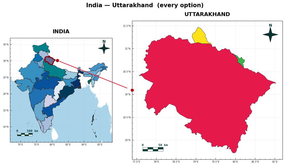
AcadGIS wraps the same matplotlib machinery but exposes the furniture as keyword arguments on a single plot() call, with the projection handled internally so the scale bar is always metric-correct. The north_arrow and scale_bar defaults are already True; you switch on the graticule explicitly.
This is the fast path for a study-area map generator workflow, where you want a clean locator figure without assembling four libraries. It reads honestly as "which pieces do I want" rather than "how do I wire each piece up." Because it is a script, the figure regenerates the moment your boundary data or highlighted region changes.
import acadgis as agis

gdf = agis.load_boundaries("India", level="state")
agis.plot(
    gdf,
    title="Uttarakhand study area",
    highlight="Uttarakhand",
    north_arrow=True,   # compass, on by default
    scale_bar=True,     # metric scale bar, on by default
    graticule=True,     # lat/lon grid with labels
)
agis.save("study_area.png", dpi=300)
Getting the scale bar right: why projection matters
A scale bar is only truthful in a projected coordinate system with metric units. Raw boundary data from GADM or Natural Earth usually arrives in EPSG:4326 (degrees of latitude and longitude). One degree of longitude is about 111 km at the equator but shrinks toward zero at the poles, so a bar drawn over unprojected data reports a distance that changes across the map.
In the manual stack you must remember to call gdf.to_crs(...) into an appropriate UTM zone or national grid before adding ScaleBar. This is the single most common mistake in Python cartography, and it is silent — the bar still draws, it is just wrong. AcadGIS projects to a suitable metric CRS internally when scale_bar=True, which removes that failure mode, but it is worth understanding the rule so you can sanity-check any map, whatever tool made it. A quick test: if your axis ticks read in single or double digits (degrees) rather than hundreds of thousands (meters), the data is still unprojected and the scale bar cannot be trusted.
import acadgis as agis

# A district-level locator with all three furniture elements
gdf = agis.load_boundaries("Bangladesh", level="district")
agis.plot(
    gdf,
    highlight="Madaripur",
    title="Madaripur district",
    graticule=True,   # scale_bar and north_arrow are True by default
)
agis.save("madaripur.png", dpi=300)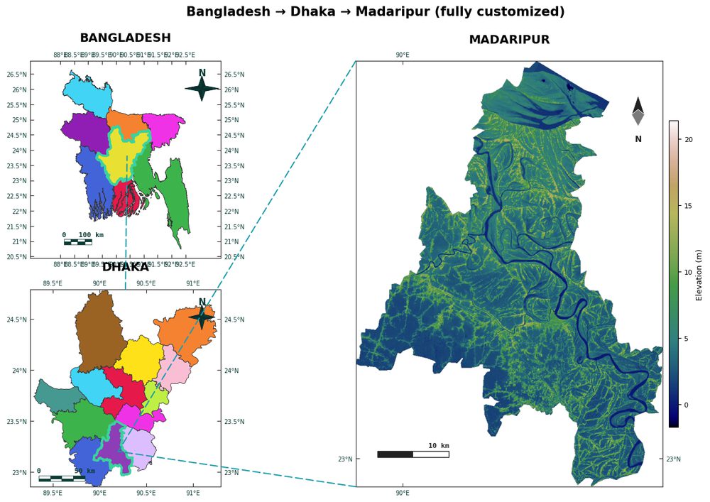
When to reach for cartopy, QGIS or ArcGIS instead
Be honest with yourself about the job. For a reproducible figure in a paper, a scripted Python approach — geopandas plus add-ons, cartopy, or AcadGIS — wins because the map regenerates when your data changes. For heavy projection work, geodesic graticules, or globe-scale maps, cartopy is the mature specialist and its labelled gridlines are excellent. For one-off interactive layout, desktop QGIS (free) or ArcGIS Pro (commercial) let you drag furniture onto a print composer by hand; folium and contextily cover web maps and basemap tiles but are weaker on print-quality scale bars and north arrows.
AcadGIS sits in the scripted-figure niche: it does not replace cartopy's projection depth or QGIS's interactivity, but for a clean, publication-ready static map with correct furniture in a few lines, it removes the assembly work. Pick the tool that matches how many times you expect to regenerate the figure.
| Tool | Best for | Furniture support |
|---|---|---|
| geopandas + add-ons | Scripted static figures | Scale bar and north arrow via extra libraries; manual graticule |
| cartopy | Projections and global maps | Strong graticules; scale bar and north arrow are manual |
| AcadGIS | Fast publication-ready study-area maps | North arrow, scale bar and graticule as plot() arguments |
| QGIS / ArcGIS | Interactive one-off layouts | Full furniture via print composer, drag-and-drop |
| folium / contextily | Web maps and tiled basemaps | Basic scale control; weak print north arrow and scale bar |
Frequently asked questions
How do I add a north arrow, scale bar and graticule to a Python map?
You add a north arrow, scale bar and graticule to a Python map either by combining geopandas with the matplotlib-scalebar and matplotlib-map-utils libraries plus manual gridline formatting, or by passing north_arrow=True, scale_bar=True and graticule=True to a single AcadGIS plot() call. The manual route requires re-projecting to a metric CRS first so the scale bar is truthful, while AcadGIS handles that projection internally.
How do I add a north arrow to a matplotlib map?
Add a north arrow in matplotlib with the matplotlib-map-utils package, which provides a north_arrow() helper, or draw one manually with ax.annotate and an arrow patch. In AcadGIS the same result comes from passing north_arrow=True to plot(), which is on by default.
How do I add a scale bar to a Python map with geopandas?
Use the matplotlib-scalebar library: re-project your GeoDataFrame to a metric CRS with gdf.to_crs(), then call ax.add_artist(ScaleBar(1)) for one meter per projected unit. AcadGIS handles the projection internally and adds the scale bar with scale_bar=True.
Why does my scale bar show the wrong distance?
A scale bar shows the wrong distance when your data is in an unprojected lat/lon CRS like EPSG:4326, where one degree of longitude is not a fixed number of meters. Re-project to a UTM zone or national grid before drawing the bar so distances are measured in meters that stay constant across the map.
What is a graticule on a map?
A graticule is the grid of latitude and longitude lines, with coordinate labels, drawn over a map to anchor it to real-world position. In Python you can create one with cartopy's gridlines(draw_labels=True), by formatting matplotlib ticks manually, or with graticule=True in AcadGIS.
Should I use cartopy or geopandas for map furniture?
Use cartopy when you need projections, global maps or geodesic graticules, since its labelled gridlines are the most robust. Use geopandas with matplotlib-scalebar and matplotlib-map-utils for scripted static figures where a scale bar and north arrow matter more than projection depth.