 Acad
AcadHow to Plot Latitude and Longitude Points on a Map in Python
Learning how to plot latitude and longitude points on a map in Python is one of those tasks that looks trivial until you need a figure clean enough for a journal. The quick answer is a scatter of dots; the research answer is those dots on a real study-area basemap, sized by a measured value, with a legend, scale bar, and north arrow. This guide walks through both, comparing folium, plotly, geopandas, and AcadGIS so you can pick the right tool for the job.
The research problem: dots are easy, publication-ready maps are not
Every mapping tutorial shows you a scatter of coordinates on blank axes. That is fine for a sanity check, but it is not what a reviewer wants to see. A publication-ready point map needs a recognizable basemap so readers can place your sites geographically, a legend that explains what the markers mean, and cartographic furniture like a scale bar and north arrow. It should also survive being printed in grayscale at 300 dpi.
So the real question is not just how to plot lat/long points in Python, but how to turn a table of coordinates into a figure that communicates. That means choosing between an interactive map (great on screen, useless in a PDF) and a static one (the opposite), and deciding whether your points should encode a value through color or size. The sections below give you a comparison table first, then working code for each route.
Comparing the main ways to plot lat/long points in Python
There is no single best library; there is a best library for your output. If you are building a web dashboard, folium (a Python wrapper around Leaflet) or plotly gives you pan-and-zoom interactivity and tooltips for free. If you are making a figure for a thesis or paper, you want a static renderer: geopandas plus contextily for tiles, cartopy for projection-aware maps, or AcadGIS for a study-area basemap with reference elements already wired in. Standalone GIS applications like QGIS and ArcGIS Pro remain excellent for interactive editing but take you out of a reproducible script.
The table below summarizes the practical trade-offs. Match the Best for column to your deliverable and the decision is usually obvious. If your endpoint is a manuscript, a scriptable Python GIS mapping library keeps the whole figure reproducible from a single file.
| Method | Output | Interactive? | Basemap | Best for |
|---|---|---|---|---|
| folium | HTML / Leaflet | Yes | OSM tiles built in | Web maps, quick exploration, tooltips |
| plotly (scatter_mapbox) | HTML / JSON | Yes | Mapbox / OSM styles | Dashboards, hover data, notebooks |
| geopandas + contextily | Static PNG/PDF | No | Web tiles via contextily | Simple static figures from GeoDataFrames |
| cartopy | Static PNG/PDF | No | Natural Earth, tiles | Projection-heavy, continental/global maps |
| AcadGIS points() | Static PNG/PDF | No | Satellite/OSM/terrain, offline countries | Publication figures on a study-area basemap |
| QGIS / ArcGIS Pro | App / export | Yes | Many providers | Manual cartography, one-off layouts |
Reading map coordinates from a CSV in Python
Almost every field dataset starts as a spreadsheet: one row per site, with lon and lat columns in decimal degrees and often a measured value. Mapping coordinates from a CSV in Python is the same three steps regardless of library: read the file into a DataFrame, verify the coordinate columns and their units, then hand them to a plotting function.
Two gotchas cause most broken maps. First, longitude and latitude get swapped — GeoJSON and many APIs use (lon, lat) order, while humans say "lat, lon" out loud. Second, coordinates arrive in degrees-minutes-seconds or a projected CRS instead of decimal degrees. Confirm both before plotting. AcadGIS re-exports pandas as agis.pd, so you can stay inside a single import while you inspect the data.
import acadgis as agis

df = agis.pd.read_csv("sampling_sites.csv")
print(df.head())                        # check lon, lat, value columns
print(df[["lon", "lat"]].describe())    # confirm decimal degrees
The quick interactive route: folium and plotly
If you just want to see where your GPS points fall and click through them, an interactive map is the fastest path. With folium you create a map centered on your data, then loop the rows and drop a marker for each; plotly's scatter_mapbox does the same with a single call and gives you hover tooltips out of the box. Both export to a self-contained HTML file you can share or embed.
The catch is that neither belongs in a paper. Interactive maps have no fixed scale or north arrow, the tiles are pulled live so they may not reproduce, and a screenshot of one rarely meets figure-quality standards. Use them to explore and validate, then switch to a static renderer for the version that goes in the manuscript.
The publication route: points() on a study-area basemap
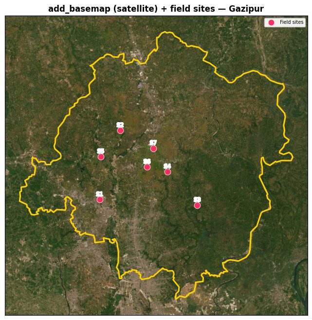
For the figure that actually ships, you want your GPS points on a map that shows the study area, not a global tile pyramid zoomed out to nothing. AcadGIS builds the basemap around your region first, then draws the points onto those axes. The points() function takes the axes, your DataFrame, and the lon/lat column names; adding size_by turns a plain point map into graduated symbols that encode a measured value through marker area.
The pattern below defines the study area, adds a satellite basemap, plots the sites sized by a value, and saves at 300 dpi. Because the basemap, scale bar, and north arrow come from the study-area builder, you get the cartographic furniture without hand-assembling it. This is the same workflow behind the sampling site map generator and the broader research area map generator.
import acadgis as agis

area = agis.StudyArea("Bangladesh").zoom_into("Gazipur", detail_level="district")
fig, ax = area.figure(suptitle="Field sampling sites, Gazipur")
agis.add_basemap(ax, style="satellite")

df = agis.pd.read_csv("sampling_sites.csv")
agis.points(ax, df, lon="lon", lat="lat", value="ndvi", size_by="count", legend=True)
agis.save("gazipur_sites.png", dpi=300)Sizing points by value: graduated symbols and bubble maps
A point map answers "where"; a graduated-symbol map answers "where and how much" in the same panel. By passing size_by to points(), each marker's area scales with a column such as population, abundance, or concentration, producing the classic bubble map used across ecology, epidemiology, and the social sciences. Pass value as well to color the markers by a second variable, and you have two dimensions encoded without adding subplots.
Design tips carry over from cartography generally: scale symbols by area rather than radius so the visual weight is honest, keep the number of legend classes small, and avoid so many overlapping bubbles that the basemap disappears. When density is the real story rather than individual sites, consider a heatmap or an interpolated surface instead of points — both of which AcadGIS also supports.
import acadgis as agis

area = agis.StudyArea("Japan").figure(suptitle="Sampling intensity")
fig, ax = area
agis.add_basemap(ax, style="light")
df = agis.pd.read_csv("japan_samples.csv")
agis.points(ax, df, lon="lon", lat="lat", size_by="count", cmap="viridis", legend=True)
agis.show()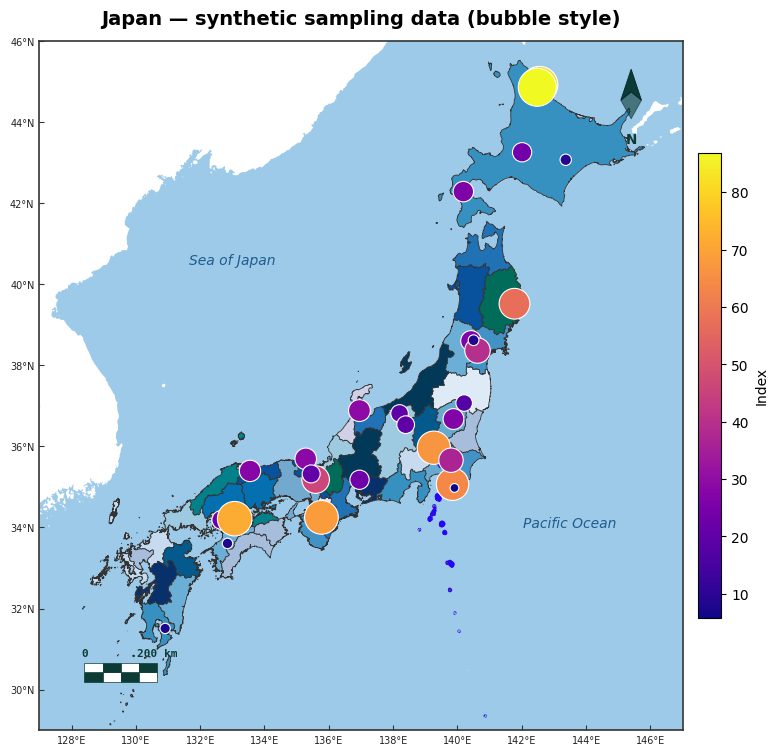
Choosing your tool and shipping the figure
Put it together and the decision tree is short. Exploring or building a web app? Reach for folium or plotly and enjoy the interactivity. Producing a static figure from an existing GeoDataFrame? geopandas with contextily is a solid, well-documented choice, and cartopy is the standard when projections matter. Producing a publication-ready point map on a study-area basemap with the least boilerplate? AcadGIS's points() gets you there in a handful of lines.
Whatever you pick, the fundamentals are the same: keep coordinates in decimal degrees, confirm lon/lat order, encode value through size or color deliberately, and export at 300 dpi for print. Data honesty matters too — basemap tiles come from providers like OpenStreetMap and satellite imagery, boundaries from sources such as GADM and Natural Earth, so cite them. Get those right and a CSV of coordinates becomes a figure a reviewer trusts.
Frequently asked questions
How do I plot latitude and longitude points on a map in Python?
Load your coordinates into a pandas DataFrame, then pass the lon and lat columns to a mapping function that draws them over a basemap. For interactive output use folium or plotly; for a static publication figure use geopandas with contextily, cartopy, or AcadGIS points(), which places the markers on a study-area basemap with a legend, scale bar, and north arrow.
How do I map coordinates from a CSV in Python?
Read the CSV with pandas (or agis.pd.read_csv), confirm the coordinate columns are named consistently and stored in decimal degrees, then hand those columns to your plotting function. The two most common failures are swapped longitude/latitude order and coordinates stored in a projected CRS or degrees-minutes-seconds instead of decimal degrees, so validate both before plotting.
What is the best library to plot GPS points on a map in Python?
It depends on your output. folium and plotly are best for interactive web maps and tooltips; geopandas plus contextily and cartopy are best for static figures from GeoDataFrames; and AcadGIS is aimed at publication-ready point maps on a study-area basemap with cartographic furniture built in. QGIS and ArcGIS Pro remain strong for manual, interactive cartography outside a script.
How do I size map points by a value in Python?
Scale each marker's area by a data column to create graduated symbols, often called a bubble map. In AcadGIS you pass size_by to points() to scale markers by a value like count or population, and optionally value to color them by a second variable. Scale by area rather than radius so the symbols represent magnitude honestly.
Can I make a static, print-quality map instead of an interactive one?
Yes. folium and plotly produce interactive HTML, but for print you want a static renderer such as geopandas, cartopy, or AcadGIS, which export PNG or PDF at a fixed scale. Save at 300 dpi and include a scale bar and north arrow so the figure meets journal figure standards.
Do I need an internet connection to build these maps?
Not always. Live web tiles and satellite imagery require a connection, but AcadGIS bundles Bangladesh, Iraq, India, and the USA offline and downloads other countries by name on first use. Boundary data commonly comes from GADM and Natural Earth, and basemap tiles from OpenStreetMap or satellite providers, so cite whichever sources your final figure uses.