 Acad
AcadHow to Make a Publication-Quality Map for a Research Paper
Learning how to make a publication-quality map for a research paper comes down to two things journals actually check: the right cartographic elements, and the right export settings. This guide gives you a practical checklist for both, compares the common tools honestly, and shows the exact steps to produce a clean, 300 DPI figure that will pass peer review.
What journals actually mean by a publication-quality map
A publication-quality map is not just a good-looking map. It is a figure that meets a specific set of technical journal map requirements for resolution, file format, and color, and that contains every element a reader needs to interpret it without the surrounding text. Editors reject figures for surprisingly mundane reasons: a 96 DPI screenshot, a missing scale bar, RGB color where CMYK was required, or a legend that only makes sense if you have read the methods section.
The good news is that these requirements are objective and checkable. If you treat map-making as a checklist rather than an art project, you can hit every target on the first submission. The rest of this guide walks through the export specs, the required elements, and how to produce the figure — whether you build it in a dedicated research-map tool or assemble it by hand in Python.
Journal figure specs: resolution, format, and color
Before you draw anything, know your target. Almost every publisher — Elsevier, Springer Nature, Wiley, PLOS, MDPI, IEEE — publishes a figure-preparation page, and they cluster around the same numbers. The table below is a practical reference for the settings that matter most when you export a 300 DPI map for paper submission.
Two rules cover most cases: export raster maps at 300 DPI minimum (600 DPI if the figure mixes a map with fine labels or line art), and prefer a lossless format (TIFF or PDF) over JPEG, which introduces compression artifacts around text and boundaries. Crucially, DPI is measured at the final print width — a 1000-pixel-wide image is only 300 DPI if it is printed at about 84 mm, so always design at the column size you will actually submit.
| Requirement | Typical value | When it applies | Notes |
|---|---|---|---|
| Resolution (photo / raster) | 300 DPI | Continuous-tone maps, satellite, terrain | Measured at final print width, not screen size |
| Resolution (line / combined art) | 600–1200 DPI | Maps with thin lines, small text, hatching | Use 600 DPI when a map has both imagery and labels |
| Raster formats | TIFF, PNG | Imagery-heavy maps, hillshade, NDVI | TIFF (LZW) preferred; avoid lossy JPEG |
| Vector formats | EPS, PDF, SVG | Line maps, choropleths, boundary figures | Stay sharp at any zoom; keep text as text |
| Color mode | RGB or CMYK | RGB for online; CMYK for print color | Convert to CMYK only if the publisher asks |
| Figure width | ≈ 84 mm (1 col) / 174 mm (2 col) | Sizing to journal column grid | Design at final size so fonts stay legible |
The required-elements checklist for a research paper map figure
A reviewer skims your research paper map figure in seconds and expects to orient themselves immediately. The six elements below are the ones referees and editors flag most often when they are missing. Treat this as a pre-submission checklist and tick every row.
Not every element is mandatory for every map — a global map rarely needs a scale bar, and a single-panel figure may fold its title into the caption — but you should make a deliberate decision about each one rather than forgetting it. A study-area map generator that turns these on by default saves you from the most common omissions.
| Element | Required? | Purpose | Common mistake |
|---|---|---|---|
| Title / caption | Yes | States what and where the map shows | Relying on body text a reader hasn't reached |
| North arrow | Usually | Fixes orientation for non-north-up maps | Omitting it, or oversizing it |
| Scale bar | Usually | Lets readers measure distance | Using a ratio (1:50,000) that breaks when resized |
| Graticule | Recommended | Gives real-world coordinates | No lat/long reference at all |
| Legend | Yes (if symbolized) | Decodes colors, classes, symbols | Ambiguous class breaks or units |
| Locator inset | Recommended | Nests the study area in its region | No wider context for an unfamiliar site |
Choosing a tool: QGIS, GeoPandas, or AcadGIS
There is no single best tool — the right one depends on how much control you need and how repeatable the figure must be. The table below compares the mainstream options for academic maps against the criteria that decide a journal figure: reproducibility, whether cartographic furniture is built in, and export fidelity.
QGIS and ArcGIS Pro are full desktop GIS applications with excellent print composers; they are ideal when you want to hand-place every element, but the workflow is point-and-click and hard to reproduce exactly. GeoPandas plus matplotlib (often with contextily for basemaps or cartopy for projections) is the standard scriptable path — fully reproducible, but you write the north arrow, scale bar, and inset yourself. Folium produces interactive Leaflet maps that are great for the web but not for a static print figure. Boundary data usually comes from GADM, Natural Earth, or OpenStreetMap, and terrain or land cover from Copernicus GLO-30, ESA WorldCover, or Sentinel-2.
AcadGIS sits between the two: it is scriptable and reproducible like GeoPandas, but ships the cartographic furniture and an academic theme by default, so a correct figure is a few lines instead of a hundred. If you already know matplotlib well and want pixel-level control, GeoPandas is a fine choice; if you want journal-ready output fast, a purpose-built thesis map maker removes the boilerplate.
| Tool | Reproducible? | Built-in map furniture | Best for | 300 DPI export |
|---|---|---|---|---|
| QGIS / ArcGIS Pro | No (GUI clicks) | Yes (print composer) | Hand-placed, one-off layouts | Manual export dialog |
| GeoPandas + matplotlib | Yes (script) | No (code it yourself) | Custom, pixel-level control | fig.savefig(dpi=300) |
| Folium | Yes (script) | Interactive only | Web / interactive maps | Not for static print |
| AcadGIS | Yes (script) | Yes (on by default) | Fast journal-ready figures | agis.save(dpi=300) |
Building the map: a study-area figure in a few lines
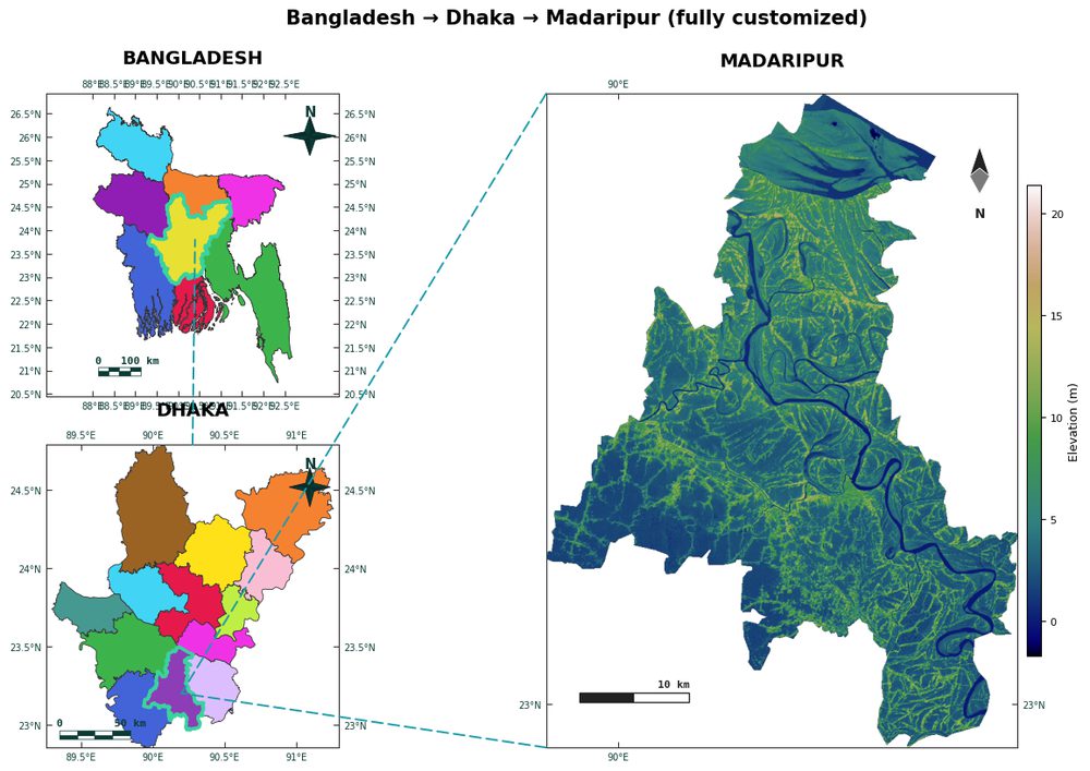
The most common map in a paper is the study-area or locator map. It nests your site inside its region and country and carries all the required furniture. With AcadGIS you name the place, and it fetches boundaries, applies the academic theme, and turns on the north arrow, scale bar, graticule, and legend automatically.
The snippet below builds a Bangladesh study-area figure zooming from country to district. Every element from the checklist is present by default, so you spend your time on content, not on positioning a scale bar.
import acadgis as agis

fig = agis.study_area(
    "Bangladesh",
    steps=[("division", "Dhaka"), ("district", "Madaripur")],
    template="cascade",
    rivers=True,
    labels=True,
)
agis.show()Symbolizing data: a colorblind-safe choropleth
When your figure maps a variable rather than just a location — population, income, a model output — the legend and color scheme become the parts reviewers scrutinize. Use a perceptually uniform, colorblind-safe palette such as viridis, and choose an explicit class scheme (quantiles or natural breaks) so the class boundaries are defensible.
AcadGIS builds a themed choropleth with a legend in one call, joining your data to the boundary layer on a shared key. The example below shades US states by a value column; swap in your own GeoDataFrame or CSV to map your results.
import acadgis as agis

gdf = agis.load_boundaries("USA", level="state")
ax = agis.choropleth(gdf, gdf, value="median_income",
                     palette="viridis", scheme="quantiles",
                     title="Median household income by state")
agis.save("figure_2.pdf", dpi=300)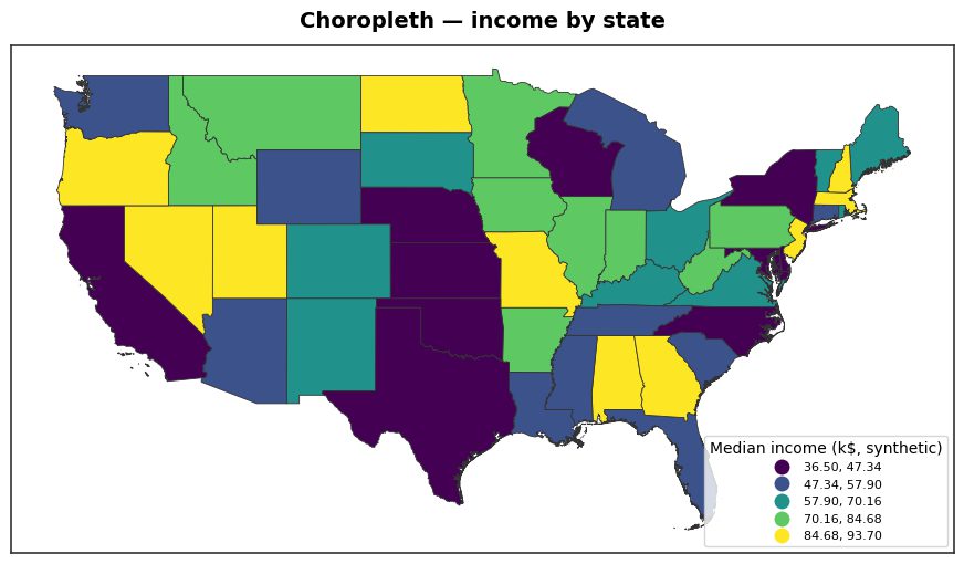
Exporting at 300 DPI: the step that decides acceptance
This is where most figures fail. A map that looks crisp on screen can be well below 300 DPI once it is placed at column width in a PDF proof. The fix is to export at the target resolution from the start rather than resizing a screenshot afterward.
In matplotlib you would call fig.savefig('map.tiff', dpi=300, bbox_inches='tight') and manage the format yourself. AcadGIS wraps that in agis.save, inferring the format from the extension so you can emit a 300 DPI TIFF for a raster-heavy map or a vector PDF for a line map from the same figure. Design at the final print width, then export.
import acadgis as agis

gdf = agis.load_boundaries("USA", level="state")
agis.plot(gdf, title="Study region", north_arrow=True,
          scale_bar=True, graticule=True, legend=True)
agis.save("figure_1.tiff", dpi=300)   # raster, 300 DPI
agis.save("figure_1.pdf",  dpi=300)   # vector for line art
A final pre-submission checklist
Before you attach the figure to your manuscript, run through this short list. It catches the errors that trigger a desk revision:
- Resolution: exported at 300 DPI (or 600 for combined line/imagery art), measured at final print width.
- Format: TIFF or PDF, not a JPEG or a screenshot; vector where the map is line-based.
- Color: RGB for online journals, CMYK only if the publisher requires it.
- Elements: title/caption, north arrow, scale bar, graticule, legend, and inset all present or consciously excluded.
- Legibility: smallest label still readable at column width; scale bar uses a distance bar, not a ratio.
- Accessibility: a colorblind-safe palette such as viridis for choropleths.
Get those six rows right and your map will meet the journal map requirements of essentially every major publisher — and, more importantly, communicate your geography clearly to the reader.
Frequently asked questions
What DPI do I need for a map in a research paper?
Export maps at 300 DPI minimum for a research paper, measured at the final print width. Use 600 DPI for combined art that mixes imagery with fine lines or small labels, since thin linework aliases badly at 300 DPI. Most publishers, including Elsevier, Springer Nature, and Wiley, state these exact thresholds on their figure-preparation pages.
What file format should I use for a journal map figure?
Use TIFF or PDF for a journal map figure. TIFF (with lossless LZW compression) is ideal for raster-heavy maps like satellite imagery or hillshade, while PDF, EPS, or SVG are best for line maps and choropleths because they stay sharp at any size. Avoid JPEG, which adds compression artifacts around text and boundary lines.
Do journal maps need to be in CMYK or RGB?
Use RGB for online-only and open-access journals, which is the default for tools like matplotlib and QGIS. Convert to CMYK only when a publisher explicitly requires it for print color separation, as CMYK has a narrower gamut and can dull bright colors. Always check the specific journal's author guidelines before converting.
What elements must a publication-quality map include?
A publication-quality map should include a title or caption, a north arrow, a scale bar, a graticule with coordinates, a legend for any symbolized data, and usually a locator inset that nests the study area in its wider region. Not every element is mandatory on every map, but you should make a deliberate decision about each one rather than omitting it by accident.
Can I make a publication-ready map in Python instead of QGIS?
Yes. GeoPandas with matplotlib is the standard reproducible Python path, using GADM or Natural Earth for boundaries, though you must code the north arrow, scale bar, and inset yourself. AcadGIS is a higher-level alternative that ships these cartographic elements and an academic theme by default and exports at 300 DPI with a single agis.save call.
How do I export a map at 300 DPI in Python?
In matplotlib, call fig.savefig('map.tiff', dpi=300, bbox_inches='tight') after designing the figure at its final print width. In AcadGIS, call agis.save('figure_1.tiff', dpi=300), which infers the format from the file extension so the same figure can be written as a 300 DPI TIFF or a vector PDF. Always set the DPI at export time rather than upscaling a screenshot.